Menu
Introduction
Meaning and Concept of the Symbol
The oak tree links the brand’s contemporary expression with its original identity. Its presence in the institutional brand draws on an element of the coat of arms’ rich symbolism and integrates it into a visual language designed for the University’s day-to-day communication.
Brief Explanation of the Oak Tree of the Universidad Panamericana
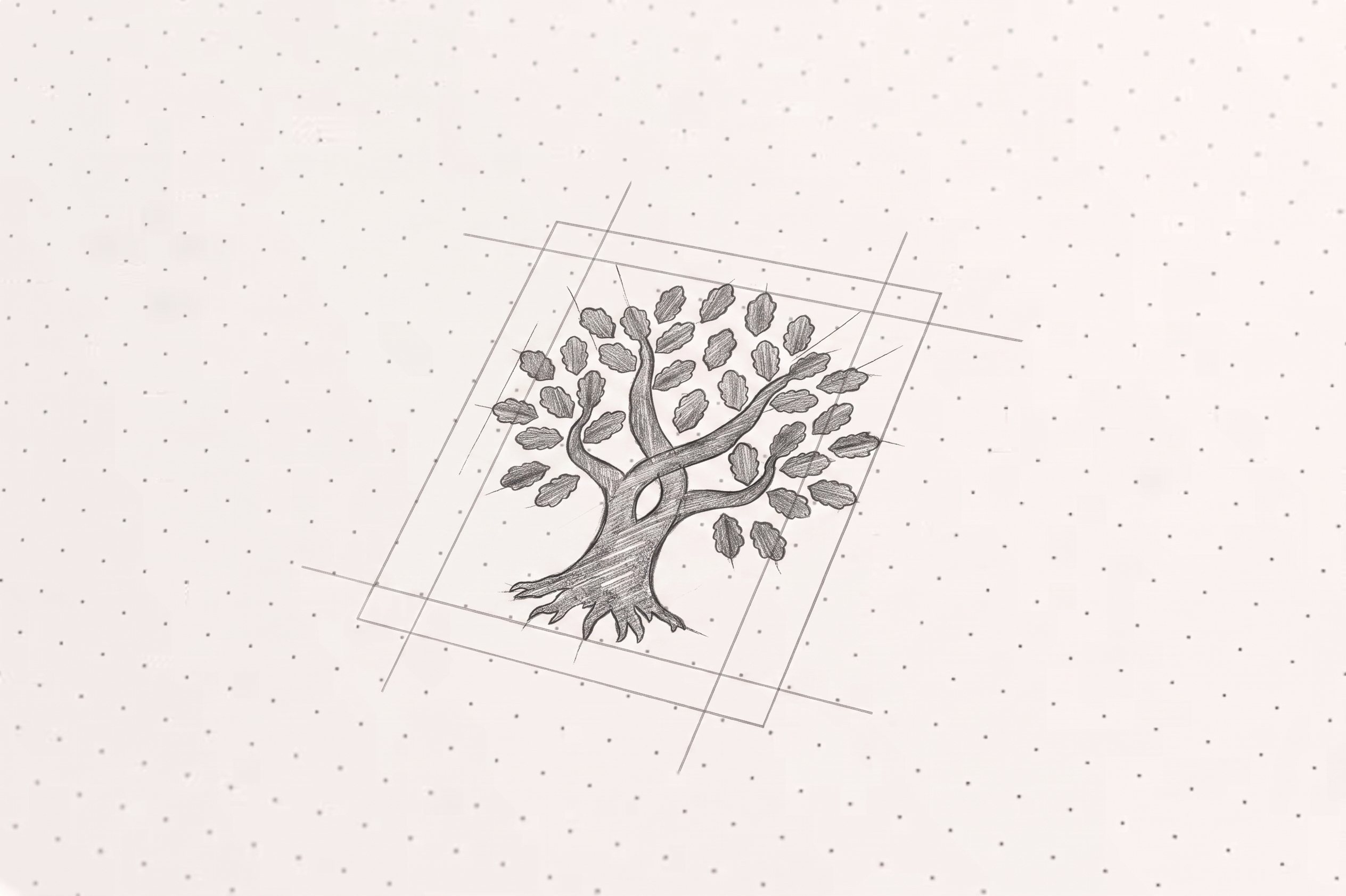
The oak tree is an element of the visual identity system of the Universidad Panamericana. Its purpose is to make the institution recognizable in its day-to-day communications through a clear and consistent visual expression. It complements the institutional coat of arms, which retains its place in ceremonial, official, and protocol-related contexts.
Connection to the University’s Identity and Values
As part of our visual identity, the oak tree symbolizes a community that places the individual at the center of its work. It embodies a university committed to the pursuit of truth, respect for freedom and human dignity, a well-rounded education, and service to society. Its graphic evolution keeps these principles intact.
Purpose of its incorporation into the institutional identity system
The oak system makes it possible to organize and unify the University’s day-to-day communications beyond its presence on the website. Its incorporation facilitates a consistent visual identity across digital platforms, informational materials, office stationery, and internal signage, without replacing the coat of arms in the formal contexts where it is appropriate
The Redesign
Why Wasthe Redesign of
Carried Out?The redesign addresses the need for a flexible visual identity for everyday communication. It aims to reduce inconsistencies across platforms and materials, simplify the institution’s visual identity, and avoid the repeated use of the coat of arms in non-ceremonial contexts.
What elements were retained
The proposal retains the oak tree as the symbol of the institutional brand and preserves the identity of the Universidad Panamericana. This evolution does not alter the institution’s essence, mission, or values; nor does it replace the coat of arms or alter the brand architecture or the core institutional color palette.
What changes were madet
The update includes adjustments to the stroke to improve legibility and a new page layout module. It also incorporates the Panamericana typeface in the university’s name, with size adjustments that enhance readability and its integration into the visual system.
What does the new“
”brand identity aim to represent? The new brand identity aims to convey a recognizable and contemporary university that preserves its identity while adapting its communication to different formats and contexts. The oak tree contributes to a clearer, more orderly, and more consistent institutional presence.
Applications
Institutional Communication
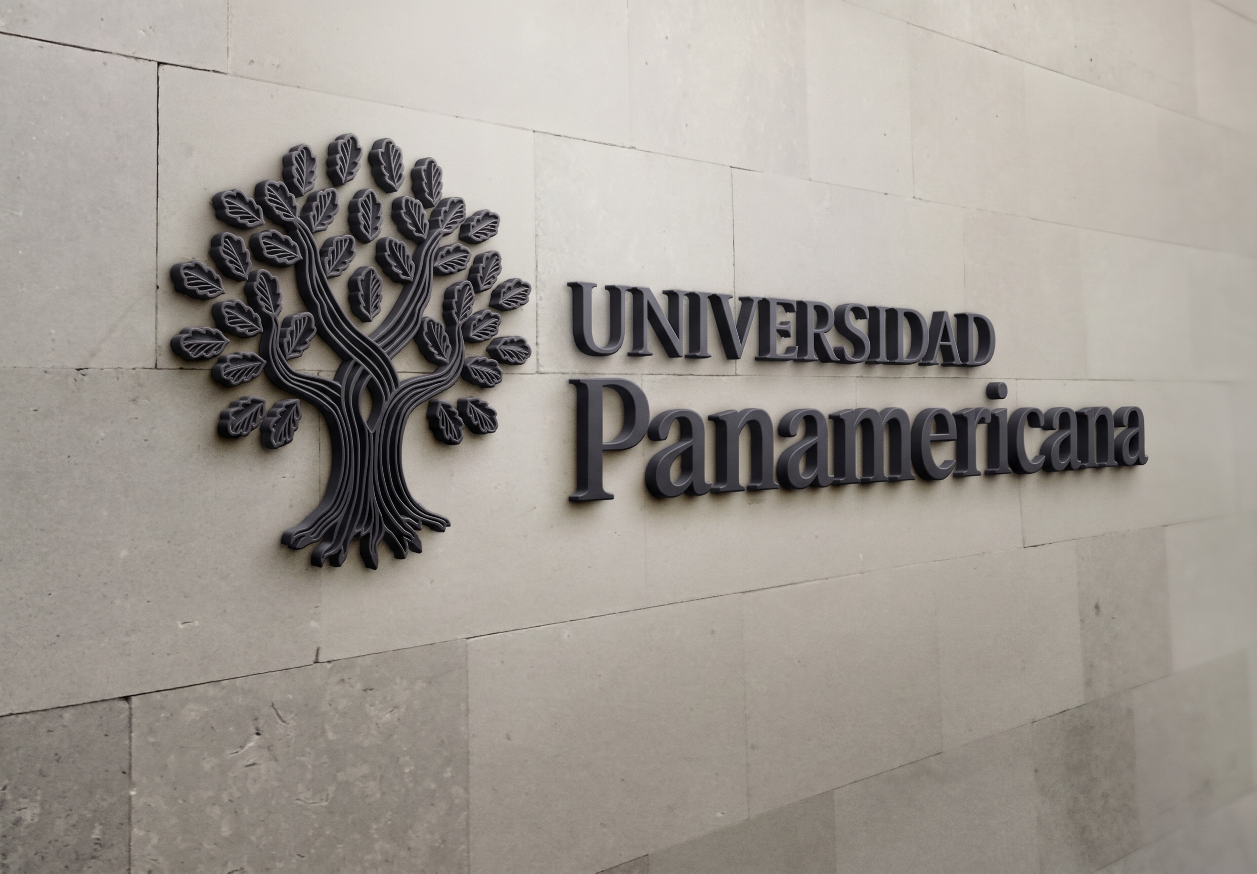
The oak tree is the symbol used in the University’s day-to-day communications, including informational publications, office stationery, and internal signage. Its use helps maintain a consistent institutional presence across the materials and spaces with which the community interacts.
Digital Environments
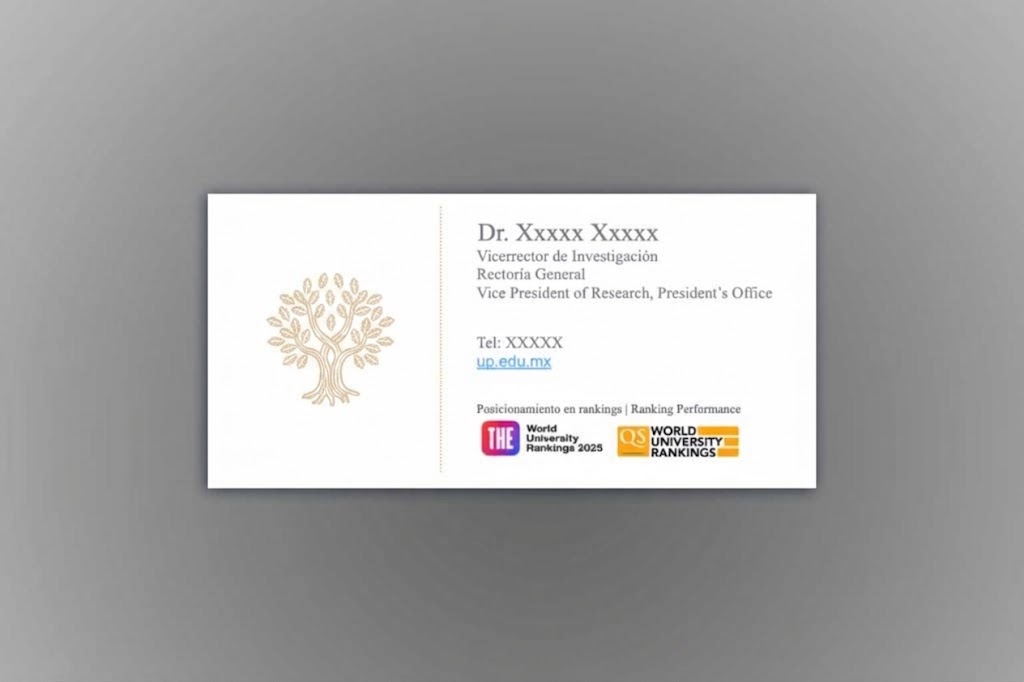
On institutional digital platforms, social media, emails, and newsletters, the oak helps make the University recognizable through a consistent visual identity. Its use must ensure the symbol remains legible and recognizable in every format.
Printed Materials
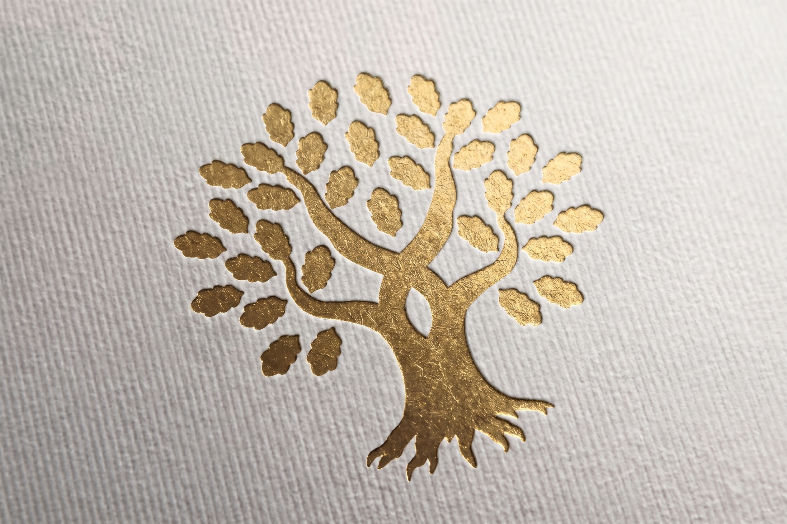
The oak motif is incorporated into business cards, letterhead, banners, and printed advertising materials. These applications convey the institutional identity through physical media, adhering to the authorized versions and ensuring the legibility of each material.
Download
Download the authorized versions of the oak logo and use the official files to maintain its shape, outline, and proportions. Each application must comply with institutional guidelines and be approved by the Institutional Communications office of the corresponding campus prior to publication.