
Menu
The redesign of the Oak logo has given it greater expressiveness, with unique features that allow Universidad Panamericana its own, tell a unique story, and build a strong brand identity.

Of the elements that make up the coat of arms, the new design prioritizes the one with the greatest symbolic significance and the least familiarity among the public: the oak tree. By highlighting its central position within the emblem, its structure, roots, and foliage have been emphasized, and the notion of strength symbolically associated with it has been accentuated.


Fonts


Brand architecture
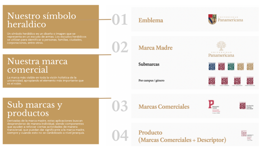
In the architectural model, when communications are issued by the sub-brands, the following versions must be used according to each academic level. These sub-brands represent the voice of each academic level in their role as an extension of Universidad Panamericana.
In accordance with the joint decision of the administrative and university leadership, it is not permitted to design logos that fall outside the scope of the brand guidelines, nor to promote any activities unrelated to maintaining the institution’s image that have not been approved by each campus’s communications management committee.
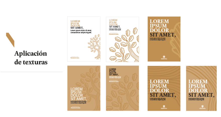
To enrich the visual language of the Universidad Panamericana Institutional Brand, a series of textures was created based on the core element of the identity: the Oak symbol.
These textures can be used in print or digital media whenever a background or pattern is needed for specific campaigns or design elements. Their use is decorative; they should not be used as the focal point of the communication.
Use of illustrations
Although it is not specified in the manual, the use of illustrations is not recommended when implementing our brand identity, for the following reasons:
Lack of consistency in the narrative
Overuse and overexposure of messages that undermine the brand’s value
The absence of the human element, which is actually the main point to convey
The NON-standardized quality of the designs
Simplicity will be the key element that defines our image.
This is a factor that conveys status, hierarchy, and positioning—essential to the branding of a prestigious university.